Overriding Components
TutorialKit’s default components are customizable with theming options. In cases where theming is not enough you can override some built-in components with your own ones.
Configuration
Define components option in your astro.config.ts:
import tutorialkit from '@tutorialkit/astro';import { defineConfig } from 'astro/config';
export default defineConfig({  integrations: [    tutorialkit({      components: {        // Component overrides go here      },    }),  ],});
For example to override TopBar, provide a path to the new Astro component:
tutorialkit({ components: { TopBar: './src/components/CustomTopBar.astro', },}),Top Bar

When overriding TopBar you can place TutorialKit’s default components using following Astro slots:
logo: Logo of the applicationopen-in-stackblitz-link: Link for opening current lesson in StackBlitzdownload-button: Button for downloading current lesson as.zipfiletheme-switch: Switch for changing the themelogin-button: For StackBlitz Enterprise user, the login button
<nav>  <slot name="logo" />
  <a href="https://tutorialkit.dev/">    Home page  </a>
  <slot name="theme-switch" />
  <LanguageSelect />
  <slot name="download-button" />
  <slot name="open-in-stackblitz-link" />
  <slot name="login-button" /></nav>
Dialog

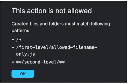
Component for overriding confirmation dialogs. This component has to be a React component and be the default export of that module.
It will receive same props that @tutorialkit/react/dialog supports:
interface Props {  /** Title of the dialog */  title: string;
  /** Text for the confirmation button */  confirmText: string;
  /** Callback invoked when dialog is closed */  onClose: () => void;
  /** Content of the dialog */  children: ReactNode;}
HeadTags
Component for overriding title, links and metadata in the <head> tag.
When overriding HeadTags you can place TutorialKit’s default components using following Astro slots:
title: The page titlelinks: Links for the favicon, fonts and other assetsmeta: Metadata and Open Graph tags
<slot name="title" /><slot name="links" /><slot name="meta" />{/** Add your own tags */}<link rel="sitemap" href="/sitemap-index.xml" />